Final Interview Page  |
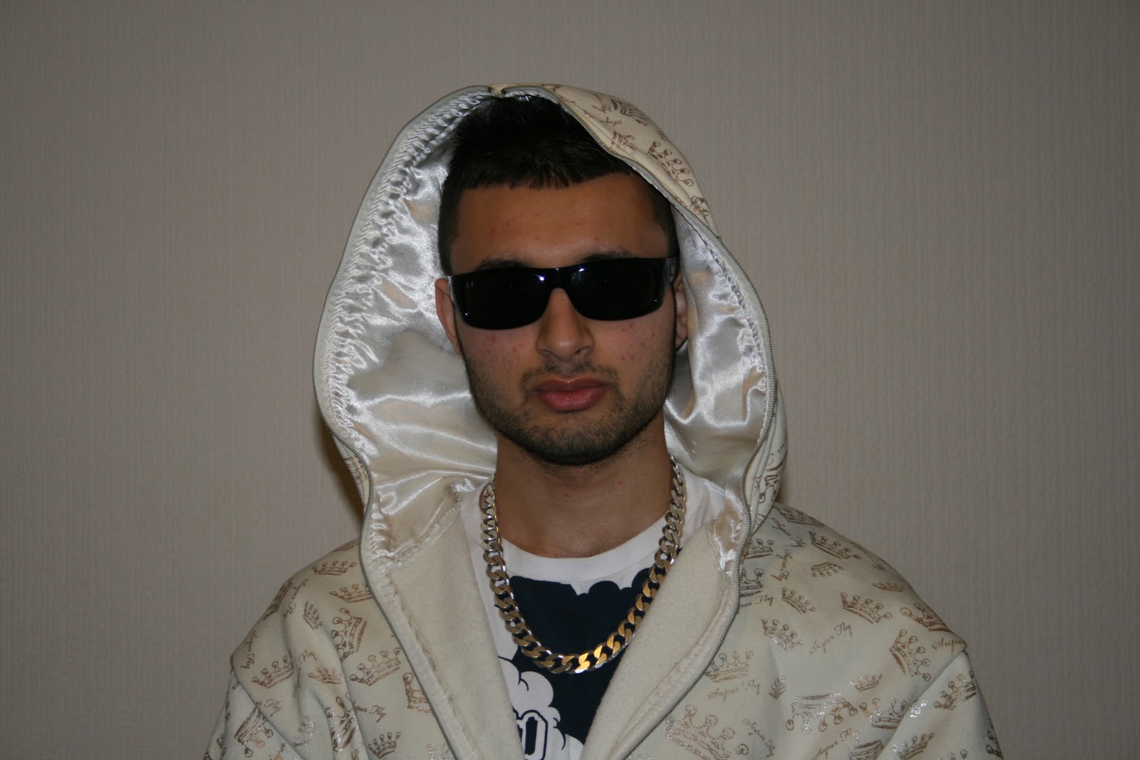
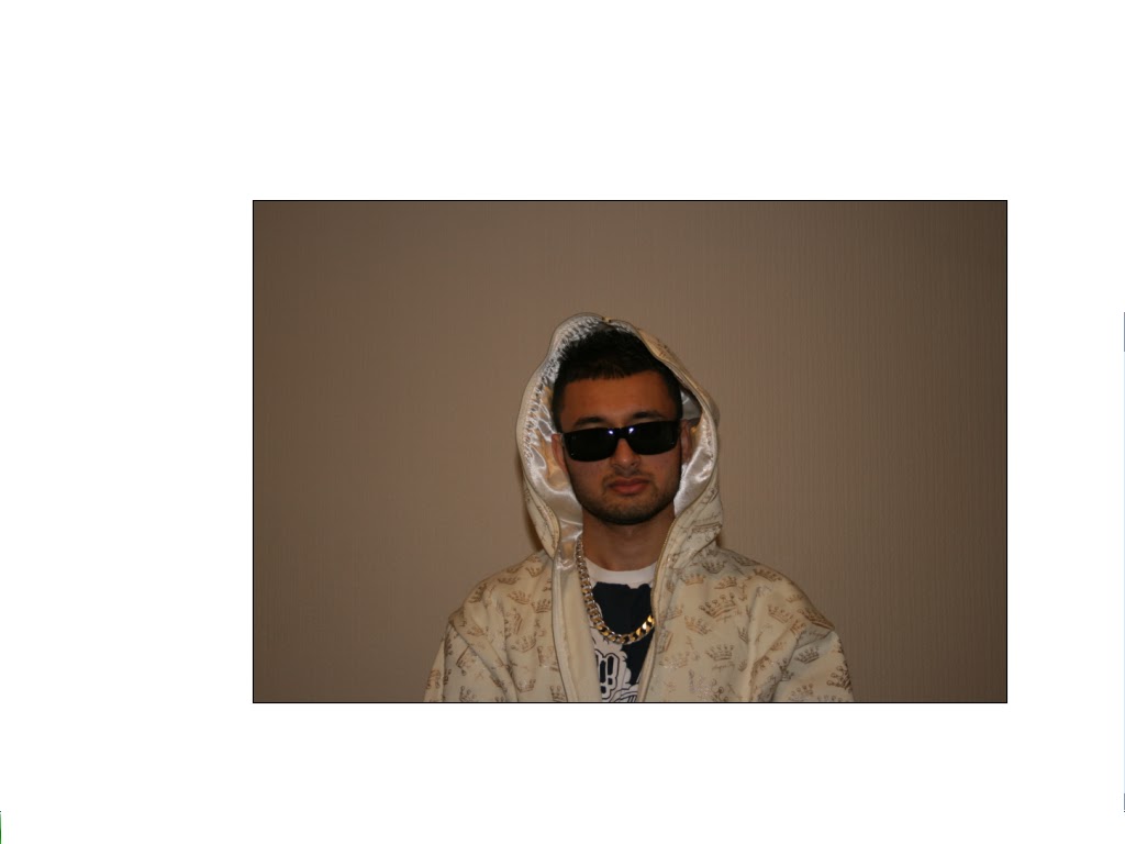
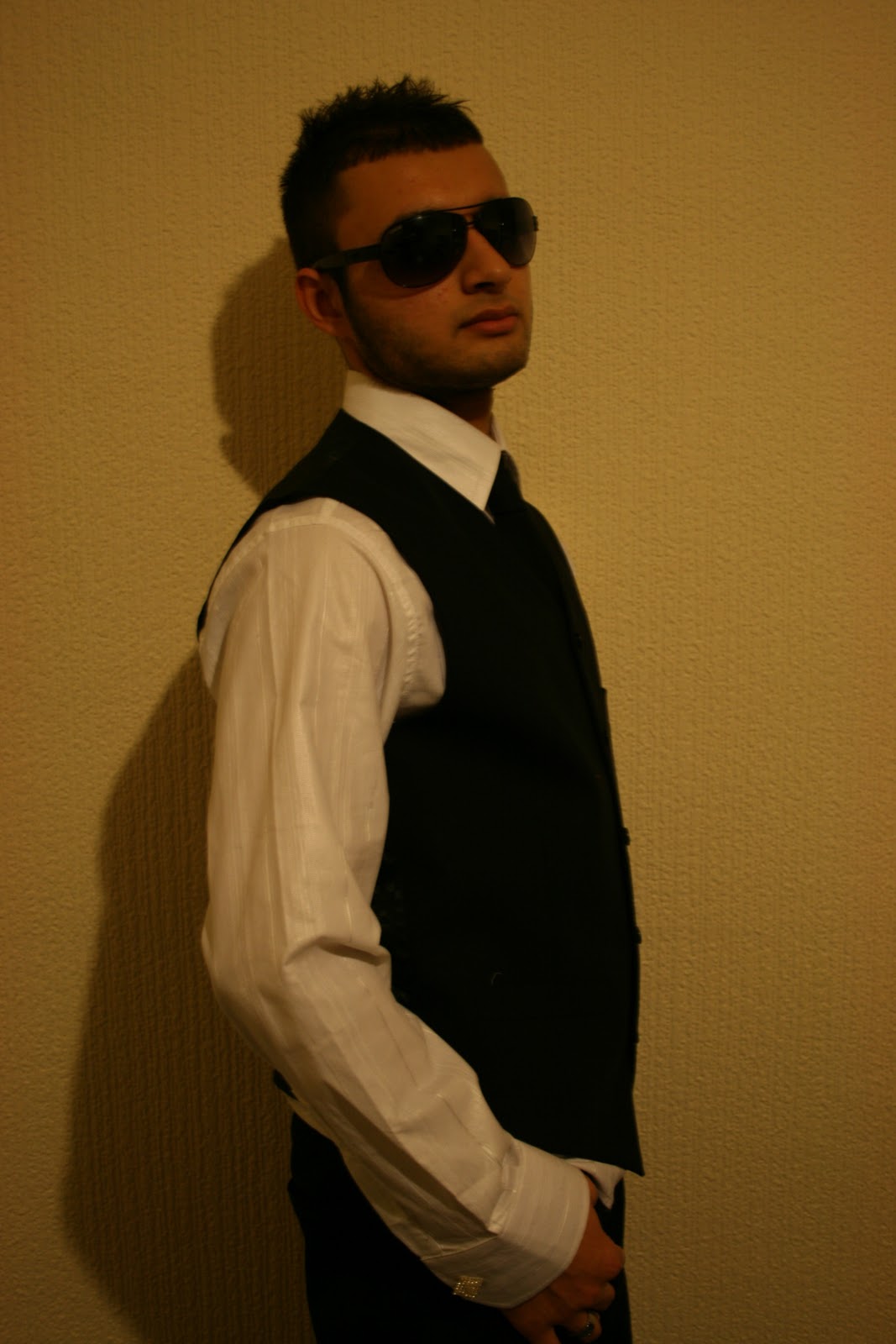
During my research into R&B/Hip-hop music magazines, I had found that double page spreads talk about a whole range of things, from interviews to new albums. There is always a subject and information about that subject. In this case, an interview about the artist. Colour schemes in double page spreads consist of no more then 3-4 colours, so which is why I chose red, black and white, referring to the same house styles and masthead used in the front cover. There is a subheader of an interview picturing a powerful image of the artist looking up, along with his name on the right hand side. This may keep a viewer engaged into who this artist is and what they have achieved. Similarly, the pull quote next to the smaller image in the top corner may engage the viewer because it may appear as eye-catching. The interview itself is easy to read and well-structured, especially for a younger target audience. Also, most double page spreads I have seen during my research has some sort of advertisements, teasers or slogans. This is why I created a little teaser at the bottom of the page. Planning my interview During my research into double page spreads, specifically interviews because I had personally thought interviews are the best way to relate to an artist, I had found that interviews were based on the artist, the music itself, song writing, sex, relationships, etc. Therefore, these were topics I had covered in my interview. Rough layout for Interview page On my interview page I had a rough idea of what I wanted as I annotated and analyzed other magazines that were a similar genre as my magazine. All of the double page spreads consisted of at least 2-3 images and the interview. So my rought idea for my magazine will be containing a image which will be taking up one whole page which will be on the left hand side. The layout of the interview will be easy to read and will not be complicated as my target audience are the type of audience which will like the interview easy and readable. Also my interview will have a sub heading which will tell us what the page will be about and also the artist name which will be bold and big, so that the readers will know who the artist is and will have a idea on what will be coming up. Before and after Interview Shots   I had used a plain, light background so when I edit it on photoshop, it would be easier for me to cut around my artist. I had then edited this image by using photoshop by adding more brightness, sharpness and contrast to make it more lively. I had opened the image up on photoshop and cut around my model. |
Saturday, 9 April 2011
Double-page Spread
Thursday, 7 April 2011
Contents
 My contents page follows codes and conventions used in other R&B/Hip-hop magazines. During my research, of contents pages, text was aligned in little stories and images or an image was used. So i had made my contents page easy and straight forward so it will be less complicated for my target audience. My page consisted of four images each with their own story. This is why my contents page may be unique. Most contents pages had one main image whereas this one had snap shots of different images creating more engagement to the viewer. Furthermore, during my research, I had found that contents pages should not be fancy and full of colour. It should have a plain background consisting of the same house style and colour used in the front cover for any text that was used. The images used in the contents contain fashion, sex scandals, celebs, upcoming artists and depravity, which all meet codes and conventions that occur in young people's lives and what they may be interested in. |
Front Cover
Planning my Front Cover
For my front cover I had looked at other R&B/Hip-hop magazines during my research. I had listed down the things that i thought all front cover magazine always have;
- Masthead
- Teaser
- Images
- Conventions
- Bar code
- Price
- Issue number
- Other information
Also, I stuck to the house styles conveyed as i wanted my magazine to contain at least 3-4 colours so that all the issues that will be coming will have the same house styles. This idea developed from the Vibe magazine as all their magazine contained the same house styles throughout.
My Language Choice
During my research, the informal and slang use of language was frequently used throughout magazines to address their target audiences. This is usually approached by young people as my questionnaire suggested that they are the most likely group to approach informal and slang language. Therefore, using this convention in my music magazine helped me target my audience.
My Final Masthead
The name 'Frisky' refers to the verb of being energetic, lively and playful, which all relate to R&B/Hip-hop. This name is not to masculine as it can be related to both sexes. Also, the word itself sounds informal which help target a young audience.
I had used this font as it is bold and eye catching. I had made this more engaging by making the font colour bright red as this will contrast the background . I had chosen this so that it would stand out from the white background, adding a dramatic effect because . My masthead was very similar to other mastheads used in different magazines. One way is that the actual image is placed in front of the masthead. Also, it is bold and large and most importantly, has 1-2 syllables because most R&B/Hip-hop music magazine have very snappy mastheads.
I had used this font as it is bold and eye catching. I had made this more engaging by making the font colour bright red as this will contrast the background . I had chosen this so that it would stand out from the white background, adding a dramatic effect because . My masthead was very similar to other mastheads used in different magazines. One way is that the actual image is placed in front of the masthead. Also, it is bold and large and most importantly, has 1-2 syllables because most R&B/Hip-hop music magazine have very snappy mastheads.
Magazine names
These are few of the names that came to idea when I chosen my genre which is R&B:
- Hustle
- Bumpin
- Grime
- Step-up
- Tunez
- Wave
- Flavour
Rough Front Cover layout
I had a rough on a plain white paper sketched out what i would like to want on my front cover and where codes and conventions should be. For example, I wanted my masthead to be bold and big at the top and my image to be in the centre taking up most of the page.
Before and after Shots of Front Cover
 |
| Before |
 |
| After The image before edited, is where I placed my model on a plain light background so that it will be easier to edit on photo shop. The position of the image gave my music magazine a sophisticated look in which this idea came up from all the R&B/Hip-hop magazines I had researched and therefore gave me a brief idea on how my final image should look. This is why I transformed my image which know looks like when edited. I had cut out my image in photoshop and placed it on a white background. Also, I had airbrushed my image by using 'surface blur' so my image looks flawless and maculate. The dark and shiny shade of my image is seen to be the main feature of my image on the front cover and also so it stands out, looks engaging and appealing to the males as well as the females. |
Thursday, 31 March 2011


Subscribe to:
Posts (Atom)